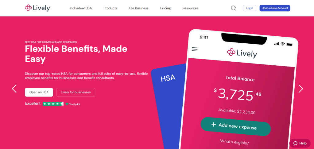
In an effort to continuously hone my craft, I decided to take on a mock project. This project involves improving the user journey for a real product: Lively.
Lively is a Health Savings Account (HSA) provider for individuals and companies. Its web platform lets you send contributions to your HSA and transfer funds from it to your investment account (HSBA). You can also withdraw from your HSBA.
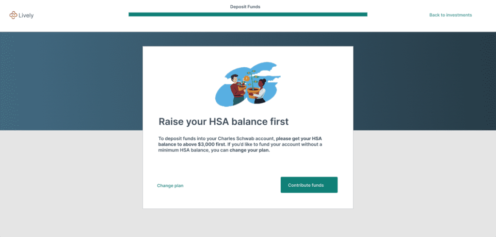
Lively has historically been free for individuals, but there’s been a recent change. Now, an individual can only transfer their HSA funds to their HSBA for free if their HSA balance is more than $3,000.
Also, they can only transfer the amount that is above $3,000 for free. Long story short, an individual’s HSA must always have a minimum balance of $3,000. The only way to bypass this is to pay a $24 annual fee.
The Problem
Since this change happened fast, executives didn’t proactively communicate it. So users only uncover the change if they go to make a transfer to their HSBA. Below is a step-by-step guide of that user experience.
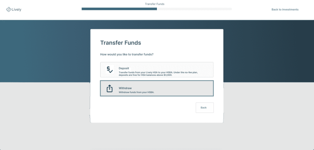
A user first lands on the Lively dashboard and selects “Transfer Funds”:

The user then selects “Deposit” on the next screen:

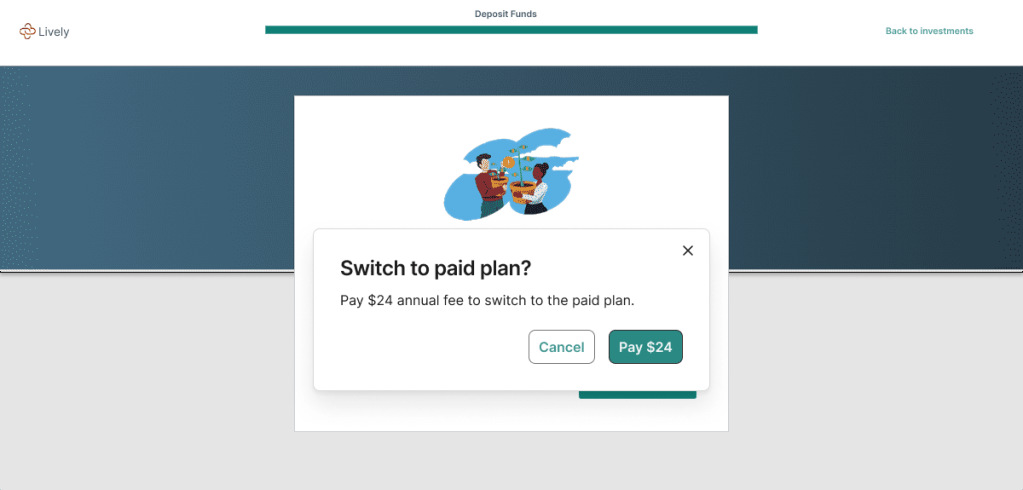
The user then selects “Change plan/fee option” on the next screen:

And the user finally ends up here:

Ultimately, this flow can be frustrating to users and discourage them from completing their tasks. As a UX writer, I empathized with the user.
So I decided to update the flow to set expectations of the change earlier on and better communicate it.
My Approach
To ensure that the user is not blindsided, I included copy hinting on the change under the ‘Contributions’ tab of the Lively dashboard.
I also included sub-copy under the word ‘Deposit’ on the second screen. This reminds any user that wants to deposit funds into their HSBA of the minimum HSA balance requirement.
Beyond that, I rewrote the copy on the third screen to make it clearer and more concise.
While writing, I kept in mind that Lively web copy is usually straightforward, businesslike, professional, formal, and polite. Ultimately, I ended up with the user experience below.
A user first lands on the Lively dashboard and selects “Transfer Funds”:

The user then selects “Deposit” on the next screen:

The user then selects “Change plan” on the next screen:

And the user finally ends up here:

Testing
To ensure that my copy was effective, I ran a test with 3 users. I sent them a brief with the situation at hand and the two versions of screens. I also asked them to fill in their feedback in a Google form survey.
The form had only 4 questions:
- Which flow do you prefer?
- Why do you like the flow you have indicated above?
- How could the flow you like most be improved?
- Do you have any other feedback on the flow?
Incorporating the Feedback
All 3 users preferred my version of the user experience. They said that it provided useful information and helped them understand the effects of their actions better.
However, 2 users wanted more information in the form of sub-copy on the second screen. They cited that this would help them better understand the options ‘Deposit’ and ‘Withdraw’.
The third user noted that he felt that there was a gap between the last two screens. He recommended that I add a screen between them with a popup reiterating that he has chosen to pay the $24 annual fee.
After incorporating all the user feedback, I ended up with the user experience below.
A user first lands on the Lively dashboard and selects “Transfer Funds”:
The user then selects “Deposit” on the next screen:
The user then selects “Change plan” on the next screen:
A modal then pops up asking the user to confirm whether they want to pay the $24 annual fee:
After clicking ‘Pay $24’, the user finally ends up here:
